
I have 100+ tabs open on my phone right now. 70+ on my desktop. CMD+Shift+T, reopen closed tab, is one of the most-used shortcuts on my keyboard. Half of those tabs are things I told myself I'd deal with later, an article, a product page, a thread I wanted to remember, and later never comes.
Who am I
I'm a software engineer, based in France, specialized in SEO and frontend: design, performance, accessibility.
I'm also a Notion coach and consultant. I help solopreneurs and companies turn digital chaos into systems that work.
I'm a Notion Ambassador too, one of 1600+. The role covers a few things, but to keep it short: early access to features before they ship, and helping the community make sense of them. A power user, basically.
On a more personal note: I'm , the diagnosed kind. Chaotic Neutral, if you speak D&D. Time blindness, a capacity to hyperfocus on what I like, and a bunch of unprompted ideas, all the time, which doesn't mean they're all good. Far from it.
Notion actually fits that well. It puts my mind at ease, a bit like a crutch. Whether that's healthy or a trap is a rabbit hole for another day.
This is a deep dive into building an entire product solo. Three months, AI-assisted, on a technical background, some product sense, and admittedly too much love for design.
It's my first browser extension. My first mobile app.
Filed is my take on an elegant Notion web clipper capture tool. It saves URLs, metadata (author, cover image, publish date...), full content, screenshots, audio notes. If you've never used one: it's a way to grab something from the web before the tab closes and it's gone for good.
I kept a changelog for every part of this as I went: one per project, plus one that stitches them all together into a single timeline. Most of the specifics in this post come straight from those.
Why I built it
Filed saves what you're browsing into Notion, structured, not just a link. At the minimum, that's a URL. It goes a lot further than that too: favicon, title, text, images, whatever the page actually has. Here's why I built another one of these.
Most comparisons treat every Notion extension as the same kind of product. They aren't. A web clipper saves a URL and some page content, you tag and organize it afterward, inside Notion.
A capture tool extracts structured content, article body, screenshot, highlight, price, whatever, and writes it directly into database properties, at the moment you save.
Only one product in this category is a pure web clipper anymore. Everything else, Filed included, is a capture tool wearing a "clipper" name because that's the term people actually search for.
I used to do SEO for a living. I kept the name anyway.
The existing Notion clippers are fine. Some are well-built. They just don't fit how I work. Here's what got in the way:
Most of them had one feature that did a thing adequately or even greatly but nothing else. You still needed multiple extensions for basic workflows, or you fell back to the DevTools console to take a full-page screenshot, for instance.
Mobile was an afterthought. The mobile ecosystem is bare, the range of what you can actually do there is close to nothing. In practice: copy the link, switch to the Notion app, paste it in yourself. That's the whole workflow.
Safari support is weak or nonexistent across the category, which stings a little since I'm not exactly a Safari fan myself, but it still holds 16.47% of global browser usage as of July 2026 (gs.statcounter.com), too big a chunk of users to write off.
The UI was consistently utilitarian in a way that never bothered to be better. That's a personal note, a frustration on my part, nothing more. Different tools for different people.
What I wanted instead
My philosophy going in, and again, this is the front-end engineer talking:
- Fewer clicks is always better
- Every extra step is a moment where the thought gets lost
- The tool should get out of the way
- UX matters: elegant, customizable, never cluttered
I also set a hard constraint for myself from the start: Filed would never store any user content. No URLs, no page text, no screenshots, no notes. The backend handles , billing state, and anonymous usage telemetry. Everything else goes directly from the browser to the Notion API. It's a choice. I could have kept some of that data somewhere, plenty of products do. I didn't want to. It's structural, like a collarbone: not bolted on, just part of how the thing is built. I wanted to be able to say that and mean it.
Some of that is personal too. I don't like ads, even at the movies. I don't like spam in my email. I don't like receiving emails I never asked for. The idea of someone else holding onto my browsing history never sat right with me, so I wasn't going to build a product that did that to other people.
What else is out there
Before any of this, I did the thing consultants tell freelancers to do and rarely do themselves: I mapped the competition. Direct Notion clippers, adjacent tools, all of it. More than a dozen products, pricing, reviews, complaint patterns.
A few things stood out, some surprising, some just confirming what I already suspected.
Notion's own official web clipper wasn't a surprise. Not many people use it, the quality is low, but it does what it says on the tin, save a URL, move on. It's not really a direct competitor so much as a baseline everyone else is trying to beat: 3.33 stars overall, 2.73 on the most recent 100 reviews. Silent failures, no property editing, missing images. It's not maintained. Notion has other priorities right now, AI chief among them, there's no reason for them to invest in a better clipper.
Save to Notion is the largest independent player in this space, roughly 400,000 installs, and it's earned that, genuinely well-loved by a lot of people who use it daily. It isn't immune to the same pattern I saw in Notion's own clipper, though: 4.31 stars overall, 3.7 on the most recent 100, and users who log out report a rough time logging back in. Real friction, at real scale, the kind that's hard to stay on top of once a tool gets this big.
Then there's the free-tier arms race, and it's stingier than I expected. Copy to Notion caps free users at 75 clips for life, not a month, forever. Flylighter caps history at 10 items. Notix caps saves at 50 a month. Filed doesn't cap saves on free at all, which felt like an obvious decision until I saw how rare that turns out to be in this category.
| Product | Adoption | Pricing | Availability | Capabilities | Data & Privacy | |||||
|---|---|---|---|---|---|---|---|---|---|---|
| Free | Lifetime | Mobile | AI | Workflow | Data path | |||||
| Save to Notion | 400K+Chrome | Unlimited clips · 4 forms | $5.99/mo Pro |   | — | — | Forms | Not disclosed | ||
| Recall | 100KChrome | Unlimited saves · 10 AI/mo | $10/mo Plus |   | Summaries | — | Local-first · cloud sync | |||
| Fabric | 20KChrome | Generous free plan | ~$5/mo Plus | | Yes | — | Cloud | |||
| Copy to Notion | 10KChrome | 75 clips for life | $3.75/mo Basic | Exists | | — | — | Forms | Not disclosed | |
| Flylighter | ~9KChrome | 10 history items | $4/mo Pro | | AI / BYOK | Flows | Cloud · direct AI | |||
| Notix | ~6KChrome | 50 saves/month | $3/mo Basic | | — | Property prefill | AI | Cloud · Firebase | ||
| Trestle | ~30Chrome | 25 AI requests · 100 bookmarks | $2.95/mo Lite | | — | AI mapping | AI | Notion + service data | ||
| Notion Web Clipper | 1M+Chrome | No stated cap | Free (Notion plan) | | — | Basic | Notion cloud | |||
| FiledThat's me! | — | Early stage | Unlimited saves · 15 AI credits | $4.99/mo Early | — | | Extraction · AI | Visual + AI + Domain | Browser → Notion · no server content | |
I've been calling this Filed since the first line of this post, but that's not what I started building it as. The original name was Recall.
One of the dozen-plus products in that research is called Recall.it, formerly getrecall.ai, half a million users, moving upmarket into AI second-brain territory. I stumbled onto it mid-build. I'm SEO by background: a name collision with a funded, larger competitor is exactly the kind of thing that quietly kills your own search visibility for years without you noticing why. I didn't debate it. I changed the name that same week.
Audio isn't really a thing in this category yet. Browser-mic memos that land directly in Notion, as both a file and a transcript, aren't something the established players have nailed. Since I'm building for both desktop and mobile, it felt like the right fit, especially on mobile: recording a quick voice memo while you're out and about makes a lot more sense than trying to type one.
AI summaries turned out to be a good fit too, though I wasn't first to think so, Notix already has AI property fill on a paid tier. None of the others I've actually described in this post do, though. Filed has it as well: Haiku-powered property fill, content summaries, and auto-tagging, shipped on Pro. The use case is simple: you save an article, you get a summary of it, right there, no extra step.
I went the other way on purpose. Filed only saves what you deliberately choose. Passive tools are interesting, but most people don't have the discipline to go back and use what piles up. It's a FOMO reflex: the satisfaction of thinking "I saved it, I'll get to it," and then it falls into oblivion.
There's an economy to it too, not just behavior, actual resources. Every auto-synced bookmark, every feed item nobody reads, still gets stored somewhere, indexed, kept warm on a server, whether anyone ever opens it again or not. Saving less, on purpose, isn't just a tidier second brain. It's less noise. Less waste. People lack intent most of the time, and that's the real problem passive tools are solving for, badly. Filed is a bet that doing this on purpose, even if it's slower, is worth it.
What I actually built in 3 months
Tailwind, Zustand (state), Zod (validation). Injected content scripts for the toolbar and selection toolbar, service worker for background tasks (OAuth interception, queue processing, alarms), React pages for the side panel and options page.
Hosted on OVH VPS (Ubuntu 24), two PM2 processes for prod and preprod. Handles OAuth (Notion), billing webhooks (LemonSqueezy), telemetry, feature flags, and an OG metadata proxy. Zero content storage: only tokens and billing data touch the backend.
App Router, TypeScript, next-intl for EN/FR routing, MDX for the blog and docs. Deployed via Nginx on OVH. Design tokens under --rc- prefix, self-hosted Satoshi font.
TypeScript, Tailwind, Zustand. Hosted at app.usefiled.app, auto-deploys on push to main. Distributed as Android TWA on Play Store. Auth via full-page redirect. localStorage only, no chrome.* APIs.
I ended up wearing every hat: designer, frontend engineer, backend engineer, DevOps, copywriter, video producer, marketer. Really interesting, and at the same time excessively exhausting, because your mind wanders in too many directions at once.
Toolbar or sidebar, the wrong question
Design took real time too. Hours scrolling Awwwards, Dribbble, Behance, and a handful of Instagram accounts, trying to figure out how this should actually look and move before writing a line of CSS.
Every other extension in this category uses a floating window. So I started there too.
It fell apart fast. What happens with more than one item? You get a scrollbar inside a tiny floating box, which is exactly as awkward and counterintuitive as it sounds.
Two instincts came out of trying to fix that. The first was a full settings page, a back-office of sorts, where you could configure everything. That didn't survive contact with reality either: you need to actually see the page you're trying to capture, not leave it to go configure something in a separate view.
The second was a sidebar. It's in the page, it floats, and it shows the website underneath the whole time. It also solved the scroll problem outright, a sidebar just takes up the full height of the screen. Obvious, in hindsight.
That felt right, and for a while it was enough. Users could set the extension's general settings, color, Notion account, stats, and then roam any page and save whatever they wanted.
At that point, though, I had a well-designed clone of the competition. Good UX isn't enough to launch a product on its own, and I knew it.
So I sat down and listed every actual frustration I had using a browser, both personal and professional. A separate extension just for full-page screenshots. The browser's print dialog, abused to generate a PDF. Opening DevTools to pull a color off a page. Ad-choked websites just to extract a palette. Digging around just to get a YouTube transcript. And the things no tool did at all: quoting a specific element, saving audio easily, annotating a screenshot, leaving a comment on a saved page for someone else to see.
That's a lot of directions at once. When I get into an ideation session like that, ADHD makes it fast, and it's fun, I can see a dozen branches and paths all at once. But I know that demon by now. Left alone, it doesn't converge, it wanders. So I needed a shape that could hold all of it without becoming the cluttered mess I was trying to avoid.
The toolbar came from Screen Studio, a tool I use for client work, screen recording for video demos and tutorials, genuinely great software. It has a floating bar of recording controls that stays out of the way until you need it. That's when I thought of a refined way to do the same thing here, using a toolbar of my own.
It's switchable with the sidebar, depending on what you actually need in the moment.
The toolbar is instant. The sidebar is advanced.
The toolbar lets you perform an action in one click, quasi-frictionless, straight into Notion. The sidebar has everything the toolbar has, but it also lets you preview what you're saving first, and stack several things together before committing.
Say you're reading a recipe with step-by-step photos. With the toolbar: click screenshot (region, full page, or viewport), and if you want more than one, you do it again, each one lands as its own separate item in Notion. With the sidebar: you see the page info first, title, favicon, you can add a note, take several screenshots in a row, or record an audio memo, all gathered into one entry before you save it.
I'd found the interface I wanted. It made sense now. But maybe because we're living in the AI era, I wanted something more: a companion, a little like Microsoft Clippy. That's how the orb happened.
There was a phase where I overshot it, too. I wanted the animation to simulate a talking wave, and I even started giving it GLaDOS's voice, from Portal, if that means anything to you. I worked on it for two or three hours before I caught it: too much. I dropped it.
The orb mattered most to me, inside all of that. I wanted something calm, almost alive, a small presence that tells you what's happening without ever feeling like a loading spinner. It's the small animated indicator that lives in the floating toolbar, shifting shape to reflect state: idle, saving, success, error, listening.
Technically: it's 8 path elements morphing via CSS keyframe animations. Durations: 5s, 7s, 6s, 10s for morphing; 25s, 18s, 23s, 31s for rotation. All prime or coprime, so no two layers ever align on the same frame. State changes swap CSS custom properties picked up by running animations, with no JavaScript. The voice amplitude is a synthetic formula: no , no audio data.
- SVG layers
- 8 paths
- Morph durations
- 5s · 7s · 6s · 10s
- Rotation durations
- 25s · 18s · 23s · 31s
- State change
- CSS custom property
- JavaScript used
- none
- Frame alignment
- never
I like where it landed, but it's not finished. Right now it works alongside plain status text: "You already saved this page." "Failure." "This is a YouTube page, would you like to save it with its transcript?" "Screenshot taken." The orb is good, but it could be better, smoother. It already serves its purpose, though: informing the user, and making the interface feel a bit more alive.
Making a workflow visible
Other competitors already had something like a workflow builder. For anyone deep enough into Notion, the value is obvious: you can map almost any page, pull out exactly what you need, and build a CRM, a contact list, a personal library, from a single setup. I wanted it available to everyone from day one, not locked behind a paywall, because that's how powerful it actually is.
Here's the actual mechanism, since "workflow" undersells it: you click an element on a page, Filed captures it as a variable, and you decide where that variable lands, as a Notion database property, or directly in the page's content. Same building block, different destinations depending on what the data actually is.
A couple of examples, since this is easier to picture than to explain abstractly. Job hunting: map the title, company, salary range, and location off a listing straight into dedicated columns, one save per posting, structured from the start. Prospecting for clients: pull a company name, industry, and contact details off a company or LinkedIn page into a CRM-style database, same mechanism, different fields. A recipe blog: ingredients as a property, instructions as page content, split however makes sense. Same tool, three completely different databases, because you decide what each field means once, and it just works after that.
What I built ended up being a lot, though. That much configurability creates real complexity. It's not for everyone, and I know that.
Two things weren't on the competitor side, and both felt necessary rather than optional: seeing what you'd actually mapped, and knowing whether it still worked.
The first: I didn't want this to live only in the sidebar, a list of field names with no connection to the page itself. So each mapped value gets a pin, right next to the actual element it came from, on the page. If something you mapped is off-screen, above or below the current view, you get a small counter instead, "3 values above," "4 values below," the same idea as an off-screen objective marker in a video game. You see it happen, instead of hoping it did.
The second: when you land on a domain Filed recognizes, it tells you straight away, four out of five values found, say. You can accept that and save, or go check what's missing yourself. Sometimes a missing value is expected and fine. Either way, you know before you commit.
On onboarding, and knowing your own audience
I tested my own onboarding flow enough times that it started to embarrass me. It took too long. I've spent years in SEO, where the data on attention spans is not flattering, people bounce fast, and faster still when something is free, there's nothing invested yet to make them push through friction the way they might for something they paid for.
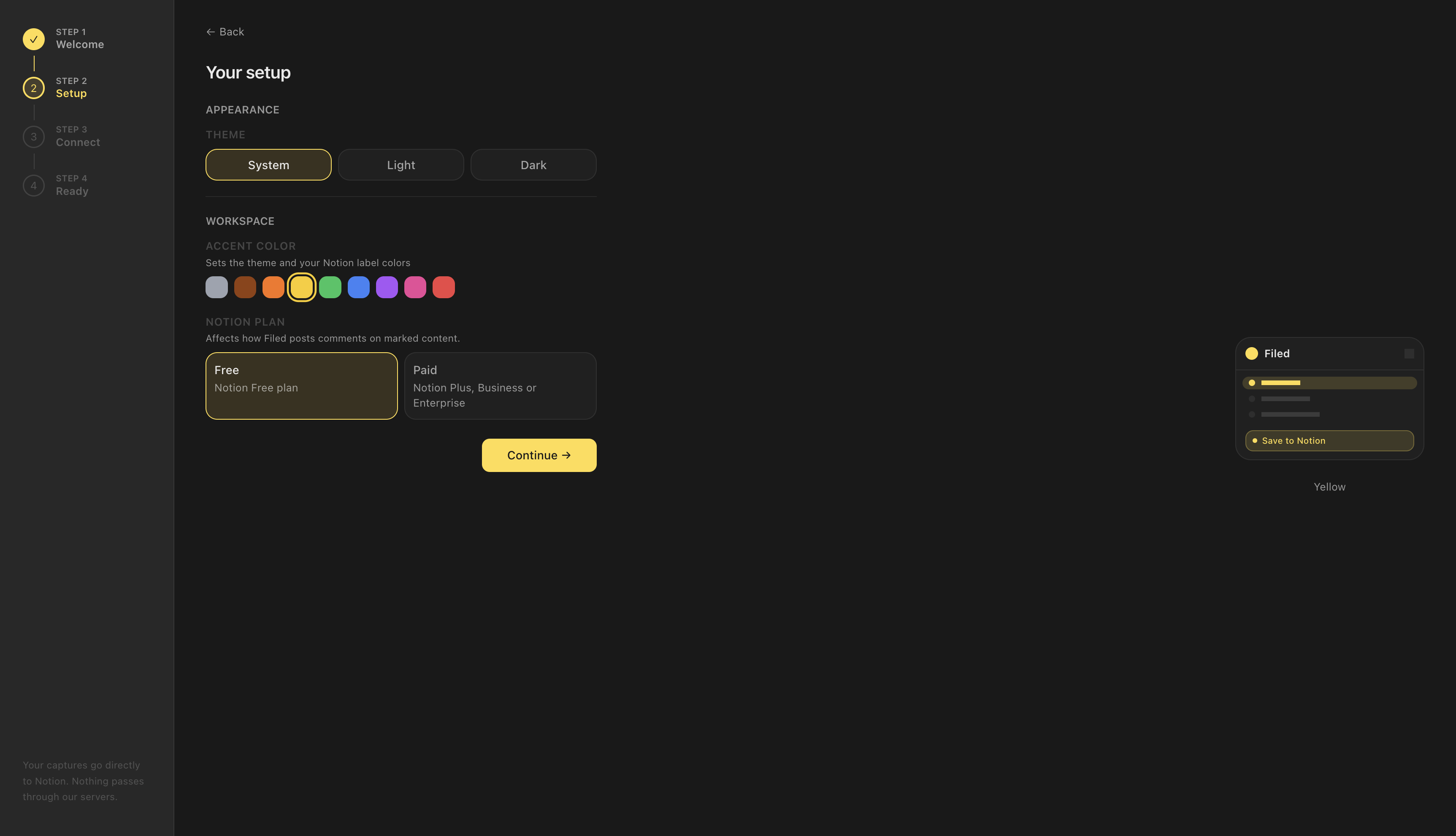
So I cut it. Step two used to ask six questions. Now it asks three: what kind of Notion account you have, dark or light theme, and whether you already have an existing account to connect. That's it. Then Notion OAuth, a template gets duplicated into your workspace, and a short tour of the options page. The whole thing is under 60 seconds, and the rest, reading speed, AI language, is auto-detected instead of asked, changeable later in Settings if it's wrong.
Then, in the same stretch of work, I built a reading-speed calibrator. You read a 260-word passage, stop a timer, and Filed uses your actual words-per-minute instead of a hardcoded 200 for every article's estimated reading time. Nobody asked for this. I built it anyway, because a hardcoded 200 felt sloppy once I noticed it.
I did catch myself once, though. Per-language reading speed profiles were on the table too. I considered it, then dropped it. Honestly, I thought it was a shame to let go. I'm just not convinced most people actually want reading-time estimates that precise. I would. I'm an odd fellow, though.
How AI actually fit into this
My memory isn't great to begin with, ADHD again, and it gets worse across a project that runs for months instead of days. Claude Code did a lot of the typing, but the more interesting part is what made it useful across three months instead of one session.
CLAUDE.md is about 600 lines: stack conventions, hard rules ("no any in TypeScript, ever"), pricing, known API constraints, keyboard shortcuts. Every new session reads it first. Think of it as less of a configuration file than an onboarding document for a junior developer with the memory of Dory.
A few custom workflows sit on top of that:
/impeccable critiquescores a UI component on 10 axes with a written rubric, tracked in a SCORES.md history file. The rule: you don't ship a component with an open issue in there./scenariowalks the codebase as a specific user would, "Free user, no workflow configured, clicks URL capture on a YouTube page," to surface gaps in handling./integration-testruns the real Notion API suite and writes a full diagnostic dump on failure, so the AI reads the dump and diagnoses instead of me pasting error logs back and forth.
Two changelogs every session, one engineering-level, one product-level. Keeping them well is what actually let me write this post, most of the specifics here came straight out of them, not memory.
A few other habits sit alongside that. A "ripple checklist" after every product change: does this touch the website copy, the pricing page, the Free/Pro boundary, design tokens, the mobile app. Anything that can't be resolved in the session becomes a named task, nothing falls through silently. Every new feature ships behind a server-side flag, so a broken one can be killed for everyone in seconds, from a phone, without waiting on a review cycle. There's also a dev/debug mode I built early on: instant state emulation, new user, free, trial, paid, without needing four real accounts to test four real states. Small thing. Saved hours.
None of that, the changelogs, the workflows, the checklist, made the actual decisions, though. What the privacy architecture is, where the Free/Pro line sits, what the orb should communicate, when to ship versus keep iterating: those live in a separate document I keep, called Core, every feature and every decision, written down once and kept current. Not the changelog. A different file, for a different kind of memory. A week away from the codebase used to mean a day of re-reading before I could touch anything. Now it doesn't.
It's a formidable tool, but it creates its own issues. It's supposed to be an accelerator, not a shortcut. I already had the technical background, the product sense, the years of frontend and SEO work behind me. What I didn't have was enough hands to build all of it alone in three months. That's the part AI actually replaced: hours, not judgment.
The technical part
A few things I ran into building this. Some of it's obscure. Some of it is well-trodden ground that still cost me real hours anyway, because knowing a gotcha exists in the abstract and actually hitting it in your own code are two different things. If you're not building a browser extension, none of this will matter to you, and that's fine, skip ahead. If you are, or you're about to, some of this might save you the days it cost me. These are my own observations, worked out solo without prior experience building browser extensions. I might be wrong about some of it. Feel free to correct me or point me at a better approach, I'll take it.
YouTube transcripts require reverse-engineering a protobuf endpoint
GET /api/timedtext, the approach nearly every open-source transcript tool uses, is intercepted by YouTube's own service worker in 2026 and returns HTTP 200 with an empty body. Not well documented anywhere, but not a hard fix once you find it: POST /youtubei/v1/get_panel with a hand-crafted params field built from the video ID, run inside to reach window.ytcfg.data_.INNERTUBE_CONTEXT. No protobuf library needed, just raw bytes and btoa().
// GET /api/timedtext returns 200 with an empty body: the page's own// service worker answers it. Build the panel request by hand instead.const bytes = [0x0a, videoId.length, ...[...videoId].map(c => c.charCodeAt(0))];const params = btoa(String.fromCharCode(...bytes)); // protobuf, no library await chrome.scripting.executeScript({target: { tabId },world: 'MAIN', // needed for window.ytcfg.data_.INNERTUBE_CONTEXTargs: [params],func: (params) => fetch('/youtubei/v1/get_panel', { method: 'POST', headers: { 'content-type': 'application/json' }, body: JSON.stringify({ context: window.ytcfg.data_.INNERTUBE_CONTEXT, params, }),}).then(r => r.json()),});Safari has three independent, surprising build-time constraints
Safari was the one that dragged. Three separate problems, and each one had its own dead end before I found the cause.
First: Vite adds crossorigin to <script type="module"> tags. Chrome and Firefox extension runtimes add the required CORS headers silently, so nobody notices it's even there. Safari's resource server doesn't. Every page just failed to load its scripts, with nothing in the console pointing at why. I spent a while suspecting the manifest before narrowing it down to that one attribute. Fix, once found: a custom Vite plugin strips it post-build.
Second: xcrun safari-web-extension-converter generates an Xcode project with individual file references, not folder references. Any file added to dist/safari/ after the initial conversion is silently ignored by the bundler, no error, no failed build, the file just isn't there. Workaround: reuse pre-existing filenames via a Vite plugin that overwrites known paths instead of creating new ones.
Third: setting in manifest.safari.json silently breaks everything. The extension appears to load. The console is empty. Nothing works, and nothing points back at the manifest as the cause. Chrome and Firefox both have an implicit inline-script exception for extension background pages. Safari doesn't. The fix was to omit the field entirely, which took longer to land on than it should have, mostly because it didn't occur to me that removing a security field could be the right move.
Those three fixes took about two hours total, roughly the total time I've put into Safari so far. It's not that it's deeply broken, I just haven't invested real time into it yet. Nothing's submitted anywhere, and I'd expect more to surface once I do.
Notion's PATCH endpoint silently discards properties
PATCH /databases/{id} with a properties body returns HTTP 200 in API version 2026-03-11. The properties are silently discarded. No error, no warning. In the current API, properties live on the underlying data source. All my ensure*Schema helpers became no-ops overnight. Every database property now has to be declared at creation time, in initial_data_source.properties. The old two-step pattern, create then patch, no longer works.
I'd built a good chunk of the schema management layer against an older API version. Check the changelog before building against a new endpoint. A silent 200 that does nothing is the worst kind of API failure, because nothing tells you it failed.
The marketplace experience, and there's always one more store
Firefox AMO reviewed the initial submission and released it the same day, July 17th. Fully automatic, no human review. Updates take minutes to an hour, also automatic. They send you an email either way. Pleasant.
Chrome Web Store sends no validation email. You check manually. The initial submission took three to four days to clear. Updates take another 24 to 48 hours, every time, even for a one-line fix. The dashboard is pages inside pages, with terminology more complicated than what it's describing. Google being very Google.
Google Play is a different beast. Forms for everything: description, audience, licence, subscription model, content rating. And you need 12 real Android testers with physical devices, you send them a link and wait. This is the moment you discover that you're surrounded by pro-Apple people. My wife. Her entire family. Their friends. I found my 12 testers eventually.
Opera has its own add-on store too, entirely separate from all of this. I submitted there around July 1st. I'm still waiting on moderation, over a month now with nothing back either way.
Edge is still on my list. The Chrome extension already works fine on Edge as-is, it's Chromium underneath, so functionally nothing's missing. But a real Edge Add-ons listing means people can find it there instead of needing to already know that a Chrome package works.
The part nobody warns you about going in: every store wants its own package, and its own version of the same information, screenshots at different dimensions, descriptions with different character limits, different category taxonomies. It's the same product, described five separate times, for five separate forms.
That cascades into more than paperwork. Different packages can mean different bugs, something breaks on one platform and not the other, and you're tracking all of it across five separate dashboards just to know who's installed what and who hasn't.
Chrome Web Store and Firefox AMO, at least, both expose real publishing APIs. I got tired of not being able to push a fix fast, so I connected both to my own project. In an emergency, that gives me two things: a feature flag to kill something broken in seconds, and the ability to deploy a real fix fast, without touching either dashboard.
The mobile gap nobody's filling
Somewhere in that research, a pattern kept repeating: not one competitor had a real mobile presence. Not because nobody wanted one, because almost no mobile browser lets you install an extension at all. Chrome on Android never has, by design, a decision Google has held onto since 2012. Firefox is the exception, but its mobile share is small enough that building for it alone wouldn't reach anyone.
Meanwhile mobile is where the browsing actually happens. As of September 2026, mobile devices account for close to 60% of global web traffic, desktop under 40% (StatCounter). Most of what people read happens on a phone, and almost nothing exists to capture it.
So something had to exist, even limited. I built it as close to a copy-paste app as I could manage: share a link directly to Filed from any app, or paste it in yourself. That's it. Filed does the rest.
It's genuinely limited, and I don't love friction. But the alternative was nothing.
Since then it's grown past just links: share a link, record an audio memo, use your camera to capture something directly, or pull from your gallery or files. Still a start. I need real feedback before I take it much further.
Right now it's a on both platforms, not native. Android's native version is already submitted and sitting in Play Store validation. iOS doesn't have one yet. I already learned that lesson once: I'm not building it until there's a real signal people want it.
Two very different problems
On desktop, the extension runs inside your own browser, with access to the page you're already looking at. It reads the title, the URL, the , meta tags, all of it, straight from the page in front of you. For custom workflows, it can even grab something specific: an h1, a table, one image. All of it happens locally, through your browser, on your own connection. None of it touches my servers.
On mobile, there's no extension, so there's nothing attached to your browsing at all. What Filed actually receives is a raw URL, shared or pasted. It can still pull a favicon, client-side, from a public icon service, no server involved. But the title, the description, the preview image, that means actually fetching the page, and right now, as a PWA, Filed is still a web page under the hood, bound by the same way any browser tab is. That's what blocks it, not a missing feature, a browser security policy.
A native app doesn't have that problem. It runs on the phone's own networking stack, not inside a browser, so CORS doesn't apply. That's exactly how WhatsApp pulls off client-side previews on mobile: native app, direct fetch, nothing routed through a server. It's part of why Android is already submitted and sitting in Play Store validation, and why iOS is next.
There's still a reason to think hard before just building the server-side version in the meantime. Security researchers Talal Haj Bakry and Tommy Mysk found that Messenger, Instagram, and LinkedIn's server-side previews weren't just grabbing a title, in some cases their servers downloaded gigabytes of linked content and ran embedded JavaScript, and if the link pointed at something private, part of it passed through the provider's own infrastructure. That's exactly the shape of thing I built Filed's privacy architecture to avoid, and it's a big part of why I'd rather wait for native than take a shortcut through my own VPS.
For now, mobile capture gets a URL and a favicon, both without my server ever seeing where you've been. Everything else, editable by hand, nothing auto-fetched. Less convenient. The native apps are the actual fix, not a workaround.
Apple and Google are not the same fight
A month into this, I got frustrated. I had a mobile PWA and nothing to show for it on my phone, no way to share into it from other apps. So I researched what sharing into a PWA looks like on each platform, and it turns out iOS and Android aren't two versions of the same problem, they're different problems wearing the same word.
On Android, the means an installed PWA shows up in the native share sheet, the same list as any other app, when you share from anywhere. Filed does this today.
On iOS, that capability doesn't exist, it's flatly absent, and it's an open feature request that's never shipped. A PWA on iOS can trigger the share sheet to send something out, but it can never register as a destination other apps can share into. That's the gap, and right now there's no way around it that isn't a fully native app.
Which gets into cost, and this is where my own bias shows. I've never liked how locked-down Apple's ecosystem is. I don't understand being that dependent on one company's permission to reach your own users. I'm saying this while typing on a MacBook Pro, so take that for what it's worth.
The numbers back the frustration up, at least. A Chrome Web Store developer account is a five-dollar one-time fee. Google Play is twenty-five dollars, also one-time. Apple's developer program is ninety-nine dollars a year, forever, or your listing disappears. Three completely different philosophies about what it costs to exist on a platform, and only one of them is a subscription just to keep breathing.
A Chrome Web Store developer account is a five-dollar one-time fee. Only one of these three is a subscription just to keep breathing.
Safari specifically has almost nobody building for it. It's still not submitted anywhere, and I've barely touched it since. It's an untapped market, though. There are users who actually need it, I've got one Reddit comment to prove it: "Great! Safari," blunt and to the point, exactly the kind of real reaction that makes it feel worth finishing. I'll admit my own bias here too. Between the SEO background and the tech-savvy people around me, almost nobody in my circle uses Safari by choice. I bought a MacBook a year ago and did the same thing I did with my old Windows machine: opened the built-in browser just long enough to download something else. If two people ever buy the lifetime plan on Safari, that alone covers about a year and a half of Apple's fee.
Android, meanwhile, is the platform I have an answer for. iOS is the one I don't. Not yet.
The hardest part, and it wasn't technical
I built a V1 while adding stuff to the roadmap, and I wasn't satisfied. Then I built the rest of the roadmap, and this V2 is what's live now. I know this was too much. I've worked on enough products to know you need real users before building more.
But I'm ADHD and I love building things. Discipline and organization aren't the same thing, though, and I used to mix them up. I'm committed. I'm also chaotic, erratic, wired to chase whatever's interesting right now. That tension is real. I "perfected" the extension as much as I could before sharing it, which is exactly what you're not supposed to do.
I didn't reach out to anyone. I kept building in a vacuum, convinced the product needed to be better before I showed it. I'm still working on that instinct, if I'm honest. What's helped has been putting guardrails in place, not just noticing the pattern.
If I'd had to do this without AI, on my own, I wouldn't have finished it, or I'd have had to work like crazy, and it was already crazy enough, day and night as it was. The trade is coherent to me. AI is a force multiplier: it let me work on multiple things at once. Not always as qualitative. A fit and an unfit for an ADHD mind at the same time. But the result is here.
The badge system is the clearest evidence of that. I built ten XP tiers across six parallel tracks, twenty-two one-time milestones, eight hidden ones, plus seasonal and cross-track badges on top, and buried a secret one that only unlocks once you've used all eleven annotation tools. It went from spec to a working version in five days, then I kept iterating on it for two more months, backend persistence, two rounds of design critique, all of it, without a single real user ever telling me they wanted any of it.
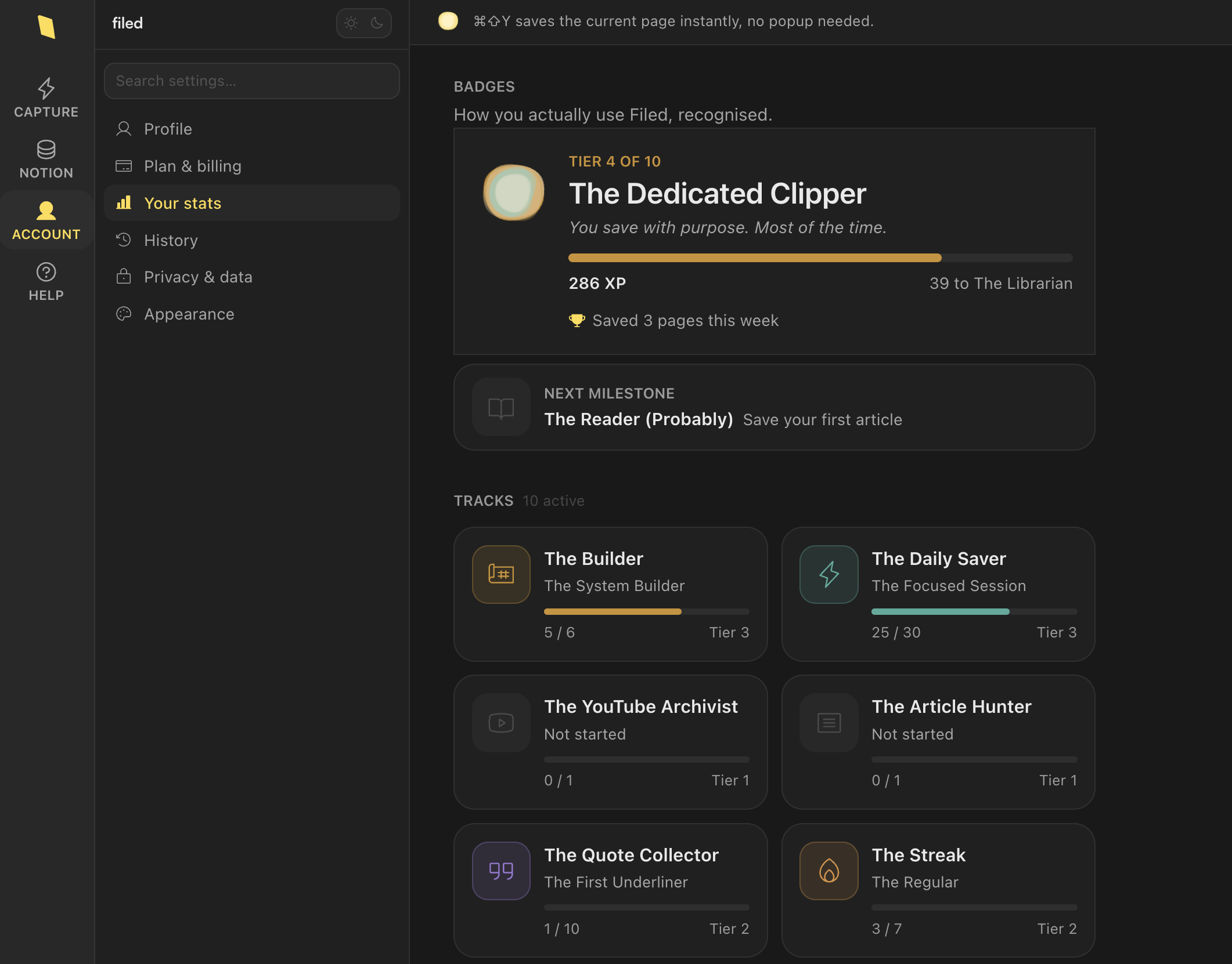
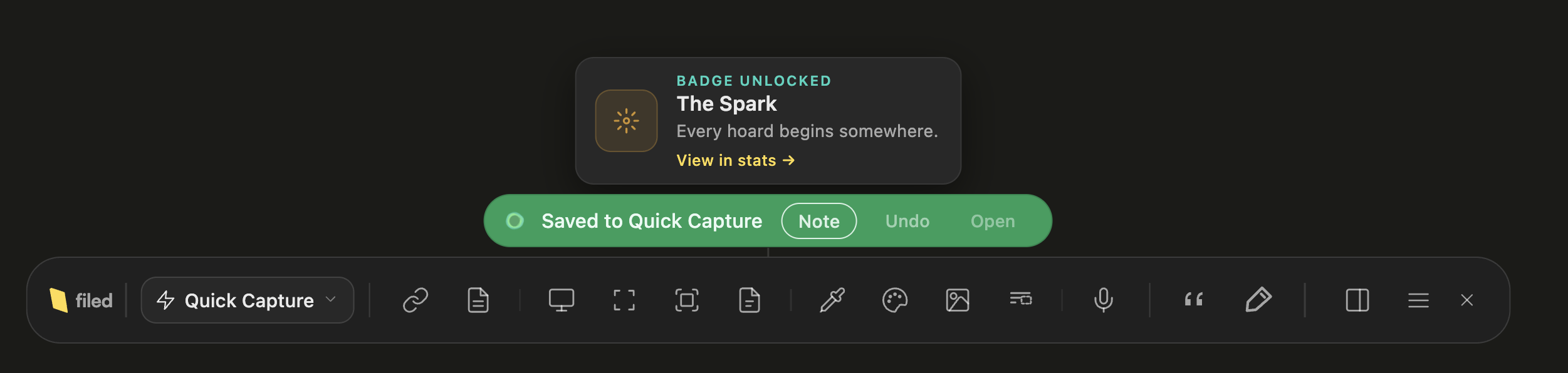
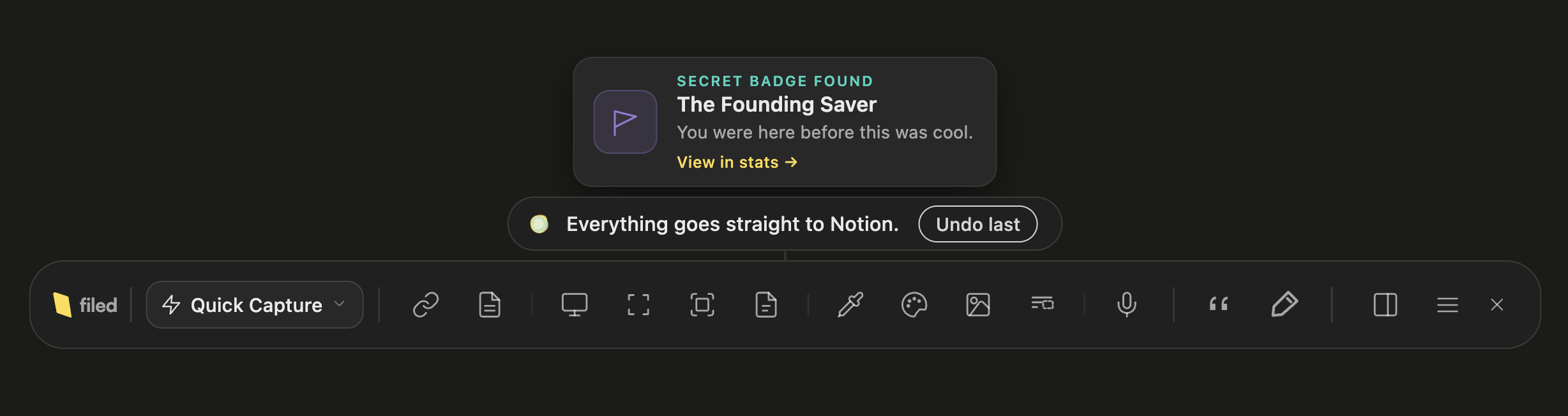
Built before a single user asked for it.
And the badges are just one example, I built plenty of thing before having any interaction, like the caveman I am.
- Real users at that point
- 0
I put real time into that dashboard. I put a lot less into the onboarding flow. It was obvious to anyone opening the app, but I was too involved to actually see it.
17 days after launch: 41 connected users, 171 saves to Notion. Feedback is what I'm focused on now. Not the next feature.
On feedback
I'm also an Engineering Manager. That part of me is wired "people first": I thrive on feedback, on hearing what someone actually thinks rather than what they think I want to hear.
I know Filed has bugs. I know there are misuses I haven't anticipated, flows that are confusing, things that should work and don't. I don't think a perfect product exists. So yeah, bugs, especially one built by a single person over three months.
I've learned a lot managing engineers, and one of the lessons about feedback was that receiving it and acting on it are not the same. I'll always listen and digest it, then decide: go fully in that direction, take a piece of it, or leave it as is. I apply that to myself daily. It'll be how I run Filed.
So if you try it and something is wrong or missing: say it. I read everything and reply to everything. I might not build what you suggest. But I'll have heard it.
One issue I caught myself
I ran a lot of tests, a lot of manual QA, while I was building the PWA. Somewhere in there I decided on a quality-of-life feature: people should be able to see their entire history, on both mobile and desktop, not just wherever they happened to save something. That meant changing a rule I'd treated as absolute up to that point, zero data on my side, no exceptions. I decided the exception was worth it, as long as it stayed optional. Off by default. URL and title only, never content.
A few weeks after shipping it, I went back through the implementation and found the "optional" part wasn't actually working. The URL and title of every save were reaching my server regardless of whether anyone had turned the toggle on. Not article content, not screenshots. But exactly the kind of thing I'd spent this whole piece explaining I refused to build, now happening by default instead of by choice.
I found it before anyone else did. That's not really the point. It shouldn't have shipped that way at all.
Fixed it properly: the toggle now actually gates the data flow, off by default, the way the decision was supposed to work from the start. Rewrote the privacy policy to describe what's actually happening instead of what I'd intended to happen, changelog included, right there on the page.
On promotion, an introvert's perspective
I'm introverted by nature. Becoming a freelance consultant already forced me out of that to some degree, but launching a product publicly is a different level.
It's a good exercise, though. You meet people who are interested in what you built, who have opinions and suggestions you'd never have generated yourself, who use Notion in ways you hadn't considered. The discomfort is worth it. I wish I'd done it sooner.
Here's what that discomfort looked like, itemized.
Every place I made myself show up
- Reddit: 6 subreddits
- LinkedIn: 2 posts, a launch post and a giveaway
- YouTube: a public teaser
- Discord: the Notion Community server
- Slack: 6 different workspaces
- Circle: the Notion creator community
- Product Hunt
What's still to build
-
Localization mostly. And features based on actual user feedback, which I now finally have.
-
Safari is being built as we speak, the two hours from earlier isn't the final number.
-
A real iOS app, not just the PWA, is on the table too, depending on what the feedback actually says. I'm not building something nobody asked for again.
Also on the list, not building but publishing: a proper demo video. Right now the only way to see what any of this does is to read about it or install it yourself. Watching someone use the toolbar for a few minutes would do more than another paragraph of mine ever will.
And, sadly, more marketing. The introvert part of this job doesn't end just because the code does.
Support is the other piece I'm still working out. A few people have already found small things and reported them gently, an OAuth step that doesn't complete, a workflow that won't save. Chrome and Firefox are already wired up to their publish APIs, so a real fix on either can ship the same hour it's found, no dashboard, no waiting. Google Play doesn't have that yet, so a fix there still means the regular submission wait. And if I'm somewhere I can't actually sit down and fix something myself, the fallback is remoting into my own machine and using AI to patch it in the moment. Same feature-flag kill switch as before, just aimed at bugs instead of features.
Some days this felt like pure thrill, doing something I'm genuinely passionate about. Some days it was just mental load, way out of my comfort zone, for months straight. Most days, both of those were true at the same time.
If you've got the same 100+ tabs problem I opened with, it's live now. Filed is free to try, no card required: usefiled.app
Happy to talk through any of the technical constraints, the extension architecture, or what I'd do differently. What was your experience building or using tools like this? If you have advice, I'm up for it.
I’m trying to be as transparent as possible, so here is the exhaustive list of tools I used.